
Case study — website redesign
Granty.org.ua
An international platform of Polish and Ukrainian experts: finding grants, preparing applications, running projects and training. We rebuilt the website so that every audience finds its own format of support in a minute — and leaves a request.
Discuss a project →
Point A — the starting request
Many formats, no choice
Video lectures, consultations with managers, a VCC-certified course and an offline workshop — four formats for different audiences. The website had to combine them into one system without turning into a catalogue.
- The formats are hard to compare: who needs just a lecture and who needs the full course
- There is no single entry point — the visitor gets lost between sections
- Requests arrive with no context: the project stage and the right manager are unknown
- Key buttons get lost among service descriptions
Process and analysis
Key growth points
We started with a simple question: what state is a person in when they land on a grants website. It turned out there are three: “I need funding but don’t know where to start”, “I’m writing an application and I’m stuck”, “I want to learn and get certified”.
We mapped the user journey:
search or referral → home page → choosing a support format → consultation form or course sign-up.
- We reduced all services to three support options: from self-paced learning to full project support
- We placed the choice block right after the hero — the visitor sees their scenario without scrolling
- We added qualification straight into the form: manager, topic of the request and preferred contact channel
- We strengthened the proof: named experts, video testimonials from graduates, VCC certification
- We turned the FAQ into a sales tool: honest answers about guarantees, pricing and payment
- We narrowed the calls to action down to two: book a consultation or go to the courses
Design and structure
First the layout, then the build
We built the full layout: the rhythm of the sections, the alternation of blue, cream and yellow, the entire scroll length. That showed where the page sags and where the visitor gets too much text — before any code was written. The same rules — grid, colours, typography, card style — then spread to the inner pages of the site.
Blue holds the key blocks: the hero, the consultation and the course. Cream is for the “calm” sections with choices and explanations. Yellow works as an accent: buttons, checkmarks and the team block.
- Dark blueheader, footer, background depth
- Bluekey blocks: hero, consultation, course
- Yellow accentbuttons, checkmarks, team block
- Creambackground for sections with choices and explanations

The result in motion
Scrolling through the page

Process — how we worked
6 steps from layout to website
The key decision in this project is simple: first the audience scenarios, then the structure, and only then — design and build.
-
1. Audience scenarios
We described the three states a person can be in when looking for grants and assigned each its own block and its own action.
-
2. Website structure
We set the order of the home page: hero → choice of format → details of each option → proof → handling objections → final action. We narrowed the navigation to five items so inner pages wouldn’t compete with the choice of format.
-
3. Layout and colour accents
We built the layout of the whole page to see the rhythm of the sections and the scroll length before the build started.
-
4. Copy and messaging
We rewrote the headlines around benefits rather than service names. We checked the tone: no promises of a guaranteed grant.
-
5. Forms with qualification
Three choices in the form — manager, topic of the request and contact channel. The manager receives the request with context already:
- which country the specialist should be from;
- what stage the project is at;
- where the person prefers to talk;
- what exactly they want to get.
-
6. Build and mobile version
We moved the layout into the existing CMS without changing hosting or page URLs, then separately checked block lengths, button sizes and the form on a phone.
Need a website that leads every client to the right service?
We’ll break your services down into audience scenarios and build the structure and copy so a visitor finds their format in a minute and leaves a request.
Point B — results
Point B
AfterThe website after the redesign
3
support options in one choice block
4
mini-courses linking to the learning platform
10
FAQ questions that handle objections
- The site guides three different audiences to three different actions
- The consultation form qualifies the request itself: manager, topic, contact channel
- Social proof in place: six named experts and video testimonials from course graduates
- The structure is ready to scale: a new format is one more card, not one more page
Scope: website: structure + design + copy + forms
The site answers three visitor questions: which format is mine, what I get and how to start.
Testimonial
What the client says
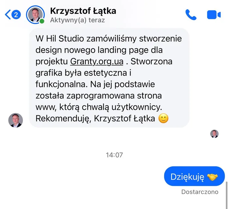
“At Hil Studio we ordered the design of a new landing page for the Granty.org.ua project. The graphics created were aesthetic and functional. The website was built on that basis, and users praise it. I recommend them”.
Krzysztof Łątka, Granty.org.ua — after the launch.
Takeaways
What this project delivered
A grants website sells through clarity, not design: within a minute a person should understand which format is theirs, what they get and how much time it costs.
What works here is not the new graphics in themselves but the decision to reduce several services to three scenarios of choice — that is what makes the site a real sales tool.
Choice instead of a catalogue
When there are several services, the home page should offer a choice, not a list: three formats with different depth and price.
Qualification at the entry point
Three select fields in the form save the manager a first call and show who the conversation is with and what it is about.
Trust built on facts
In a sensitive field what convinces people is named experts, certification, testimonials and an honest answer about what cannot be guaranteed.
Get in touch