
Case study — website + graphic design
OpSoft
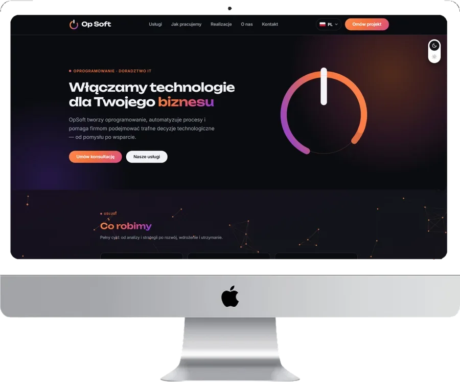
A Polish IT company that automates and optimises business processes for corporate clients across the EU. We built the identity and a website that looks mature and explains the value clearly.
Point A — the starting request
The situation at the start
The company had no coherent visual identity and no website that would look mature and credible to corporate clients while clearly communicating the value of its services.
We needed a storefront that sells and does not lose visitors coming from phones — built in five working days.
- No visual identity: neither a logo nor a consistent style
- No corporate website: the site created the wrong impression and did not explain the value
- No clear structure: no plain explanation of services, audience, outcome or how to start
- No SEO foundation: no meta tags, no considered page structure, no technical base
- Mobile was not a priority, although a large share of the B2B audience opens the site on a phone
Process and analysis
Key growth points
We started with a short discovery: what exactly the company automates, for whom, which pains it solves and why clients choose it. Then we audited the trust points that matter in B2B: positioning, site structure, visual maturity, readability on a phone, and a fast route to contact.
We mapped the client journey:
search or referral → landing on the site → understanding the value in 30–60 seconds → a request for an audit or consultation.
- Framed the positioning: what we automate, the effect on the business, who it is for
- Built a mobile-first layout: the site has to work well from a phone
- Assembled the site short and structured, no filler, focused on value
- Strengthened the trust points that decide deals in the corporate segment
- Created a recognisable identity — the brand got a face
- Laid the basic SEO so the site is ready for search traffic
Graphic design
Identity: logo and brand style
We made a minimalist logo — a power button mark standing for launching processes — and a black-and-white palette with an orange accent to convey the technology and character of the brand. The logo was delivered in two formats for different carriers: social media, favicon, documents, presentations.
- Graphitethe base of the interface and typography
- Whiteair, cleanliness, readability
- Orange accentbuttons, icons, key actions
Logo
Two formats for different carriers: social media, favicon, documents, presentations
Website
A B2B structure that emphasises trust and the value of the services
Mobile-first
Readability, visible CTA buttons, speed, logic that works on the go
SEO foundation
Meta tags, headings and technical settings for correct indexing
Process — how we worked
5 steps in 5 working days
We built the page so that a client understands within 30–60 seconds: what the company does, the benefits, how cooperation starts and where to click.
-
1. Positioning and messaging
We shaped the key statements: what we automate, the effect it gives the business and who the solution is for. That became the frame for every text on the site.
-
2. Visual identity
A minimalist logo and a black-and-white palette with an orange accent. We prepared formats for every carrier so the team could use them in materials right away.
-
3. Site structure for B2B
We built the page so a client quickly grasps four things:
- what exactly the company does;
- what the business gains;
- how cooperation starts;
- where to click to get an audit or a consultation.
-
4. Mobile-first
We tuned the mobile version separately: fast access to the CTA, short blocks, correct spacing and font sizes — so the site does not lose conversions on a phone.
-
5. SEO foundation
We wrote the meta tags, headings, basic page structure and technical settings for correct indexing — so the site is ready to be promoted through content and brand queries.
Interim results
What changed along the way
- The brand got a recognisable identity: a logo and one style for all materials
- The site began to look like a product for the corporate segment, not a temporary page
- A clear logic appeared: pain → solution → value → action
- The mobile version became convenient for quick decisions — no extra scrolling to reach contact
Need a B2B website that looks premium and works well on a phone?
We will build the positioning, identity and page structure so a corporate client understands your value within a minute and leaves a request.
Point B — results
Point B
AfterFinal results after 5 working days
5
working days for the logo, website, mobile-first and SEO
4
workstreams: logo, website, mobile-first, SEO
2
logo formats for every brand carrier
- A storefront for B2B sales: site, style and a clear CTA
- Less friction on mobile: fast buttons, readability, short blocks
- An SEO foundation: the site is ready for content, search and brand-query promotion
- The team received ready logo formats for all materials
Scope: logo + website + mobile-first + SEO foundation · Interface language: Polish
The site became a clear storefront of services: what we do, the benefits, how to start.
Testimonial
What the client says
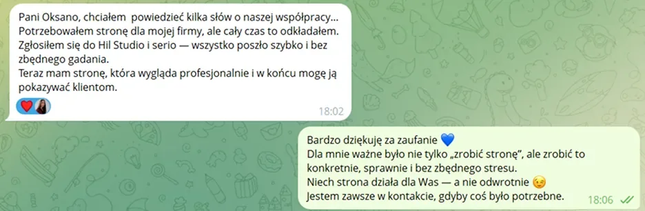
“I needed a website for my company but kept putting it off. I turned to Hil Studio and honestly — everything went fast and without unnecessary talk. Now I have a site that looks professional and I can finally show it to clients.”
Owner of OpSoft, after the site went live.
Takeaways
What this project delivered
In five working days the IT company got not just a page, but a working sales tool for the corporate segment.
What matters here is not speed itself but the order of work: positioning and messaging first, then identity, and only then the page build. That is why the site needed no rework after launch.
Meaning first, design second
Once the statements “what we do / what effect / for whom” are ready, the page structure falls into place and needs no rework.
Identity as an asset
A logo in several formats keeps working on its own: in social media, documents, presentations and proposals.
Mobile is B2B too
Corporate clients open the site on their phones too. Mobile-first removes friction exactly where requests are usually lost.
Get in touch